apparel designs///
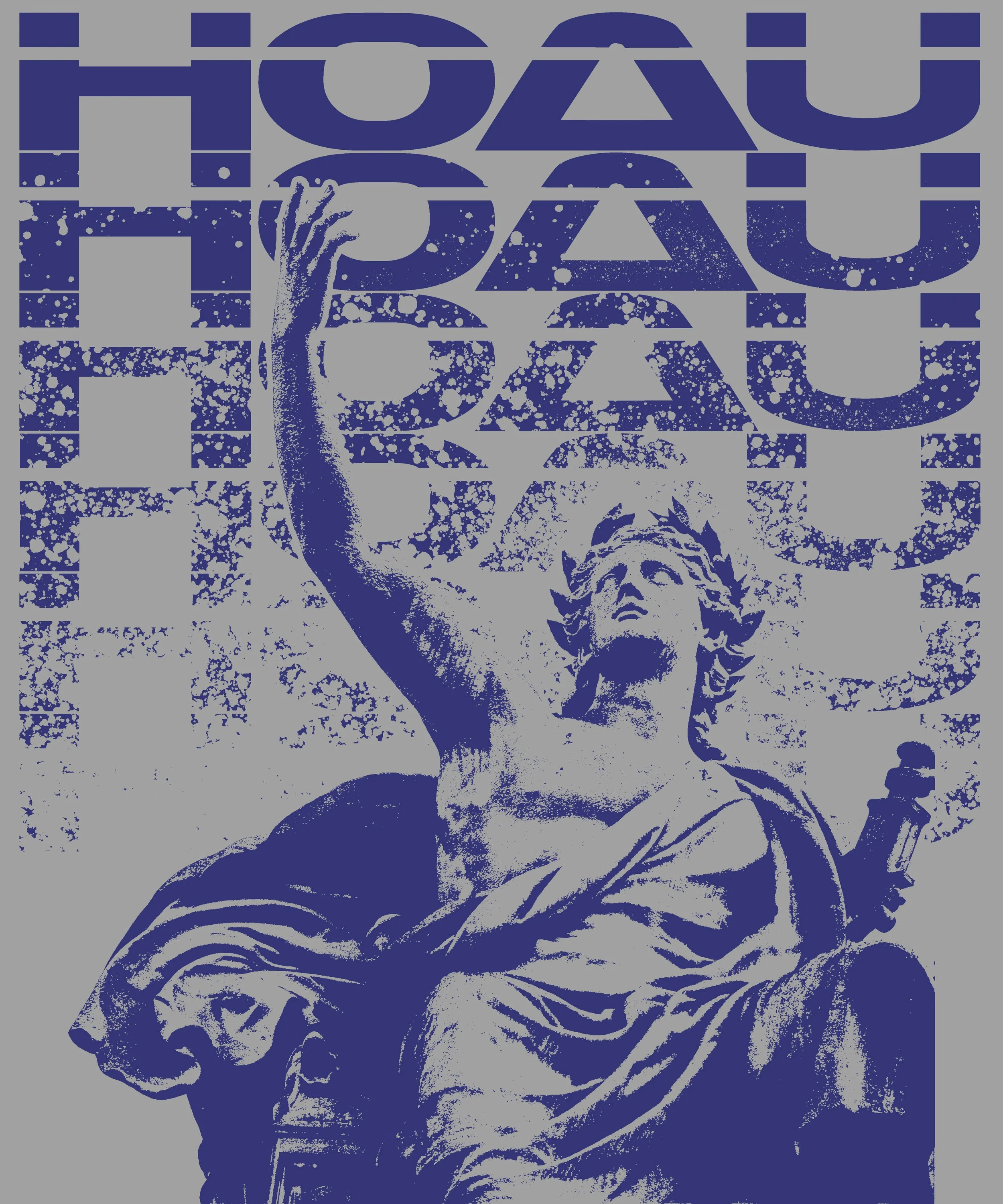
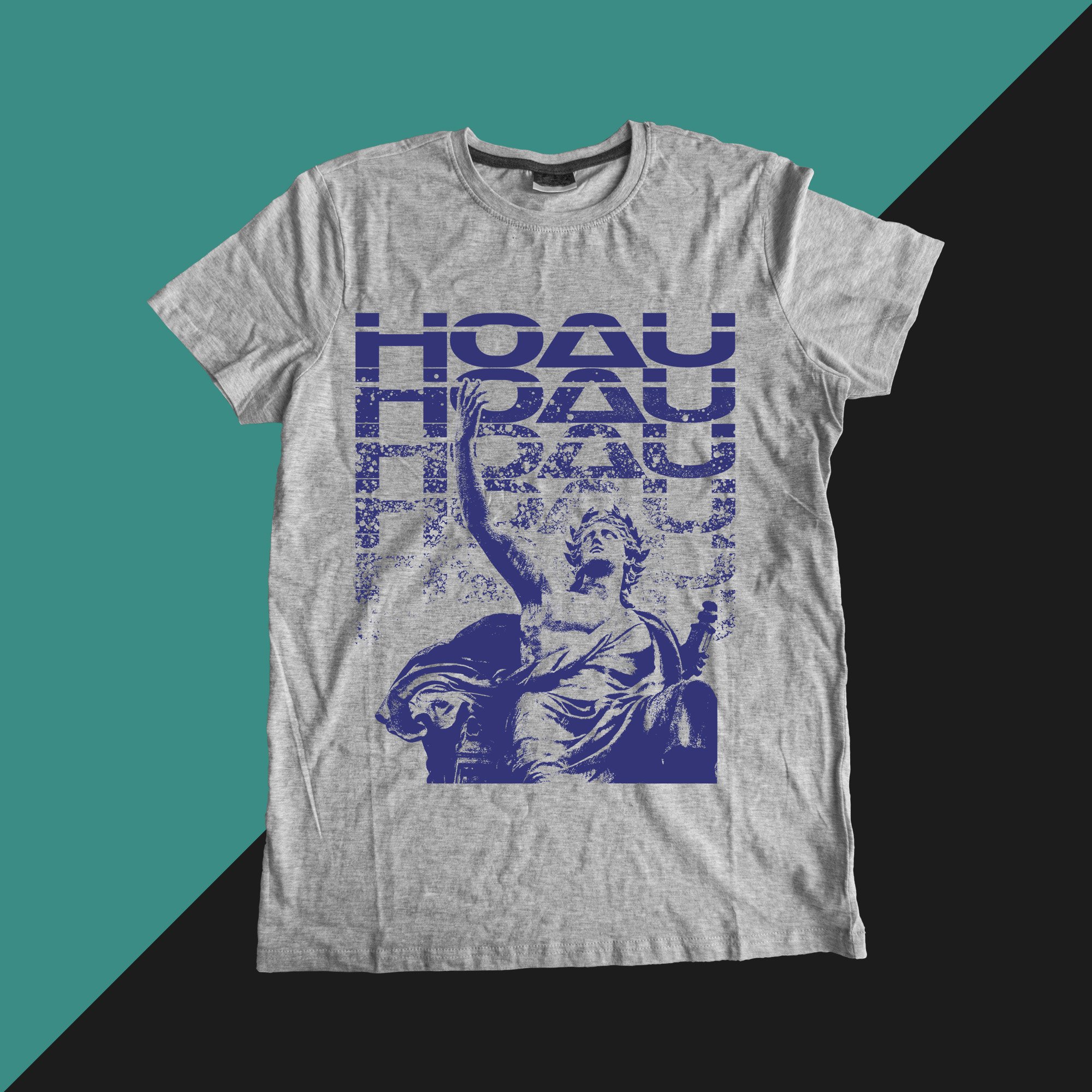
///HOAU_emperor
Merchandise design created for Hundreds of AU using layered typography, distressed textures, and classical imagery to create tension between futurism and antiquity. The project was built around the band’s existing geometric type treatment, using it as a structural anchor while contrasting it against heavily processed Greco-Roman imagery associated with permanence, mythology, and collapse.
Rather than treating the opposing visual languages separately, overprint-style texture, repetition, and controlled degradation were used to merge them into a single cohesive composition. Designed specifically for apparel application, the piece maintains strong readability and graphic impact on fabric while preserving the rough physical quality of vintage screen printed punk and hardcore merchandise. The result balances the band’s established futuristic visual identity against deteriorated classical imagery to create something that feels both synthetic and ancient at the same time.
///HOAU_ENDLESS BEIGE

This shirt anchors itself in a dominant central profile illustration constructed through layered linear patterning. The internal linework creates movement and density without compromising the clarity of the outer silhouette, allowing the form to read instantly from distance. Repetition of the secondary head motif introduces rhythm and reinforces identity without cluttering the composition. A restrained palette maintains cohesion across the garment, positioning the design between band merchandise and collectible artifact. It balances intricacy with structural restraint.

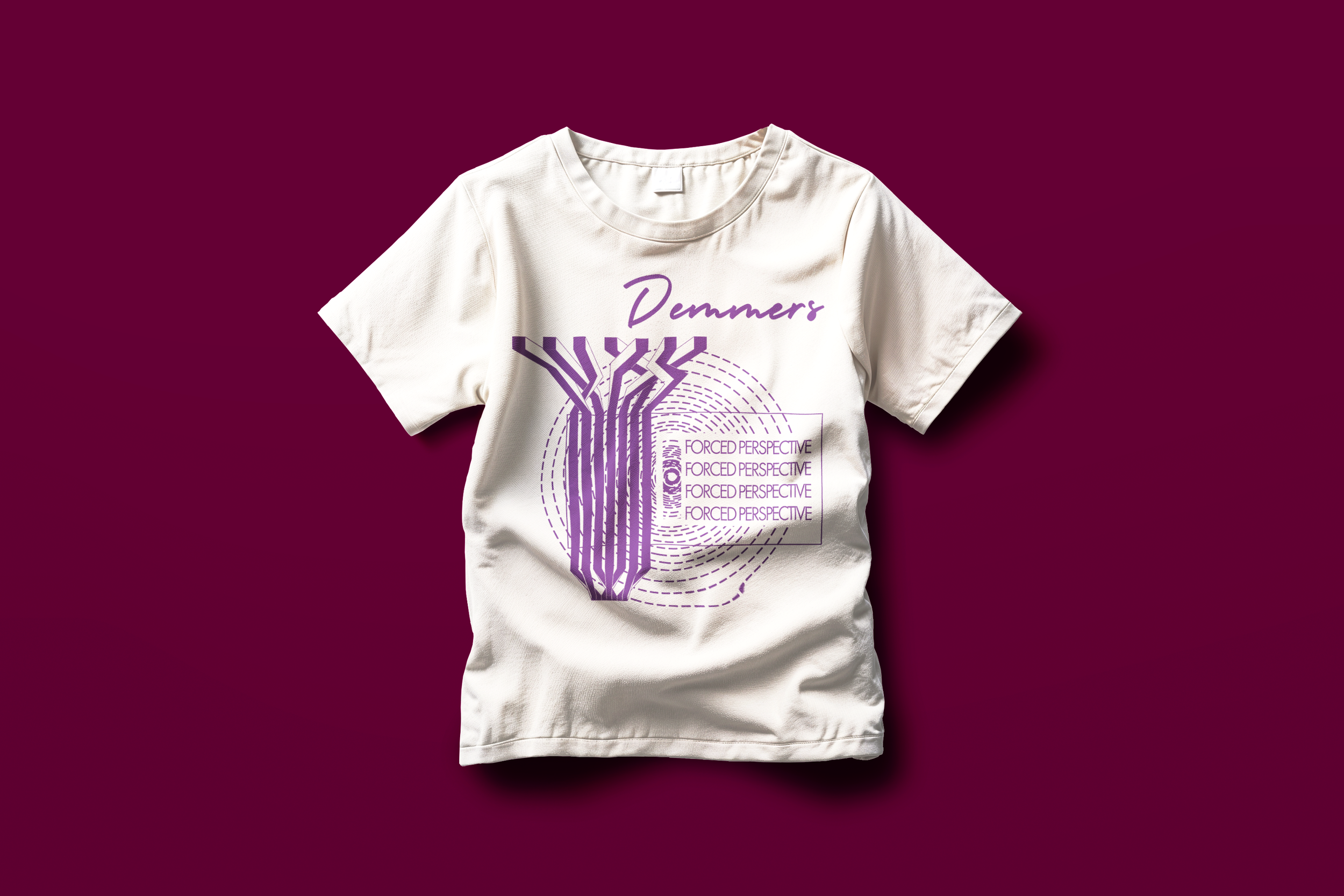
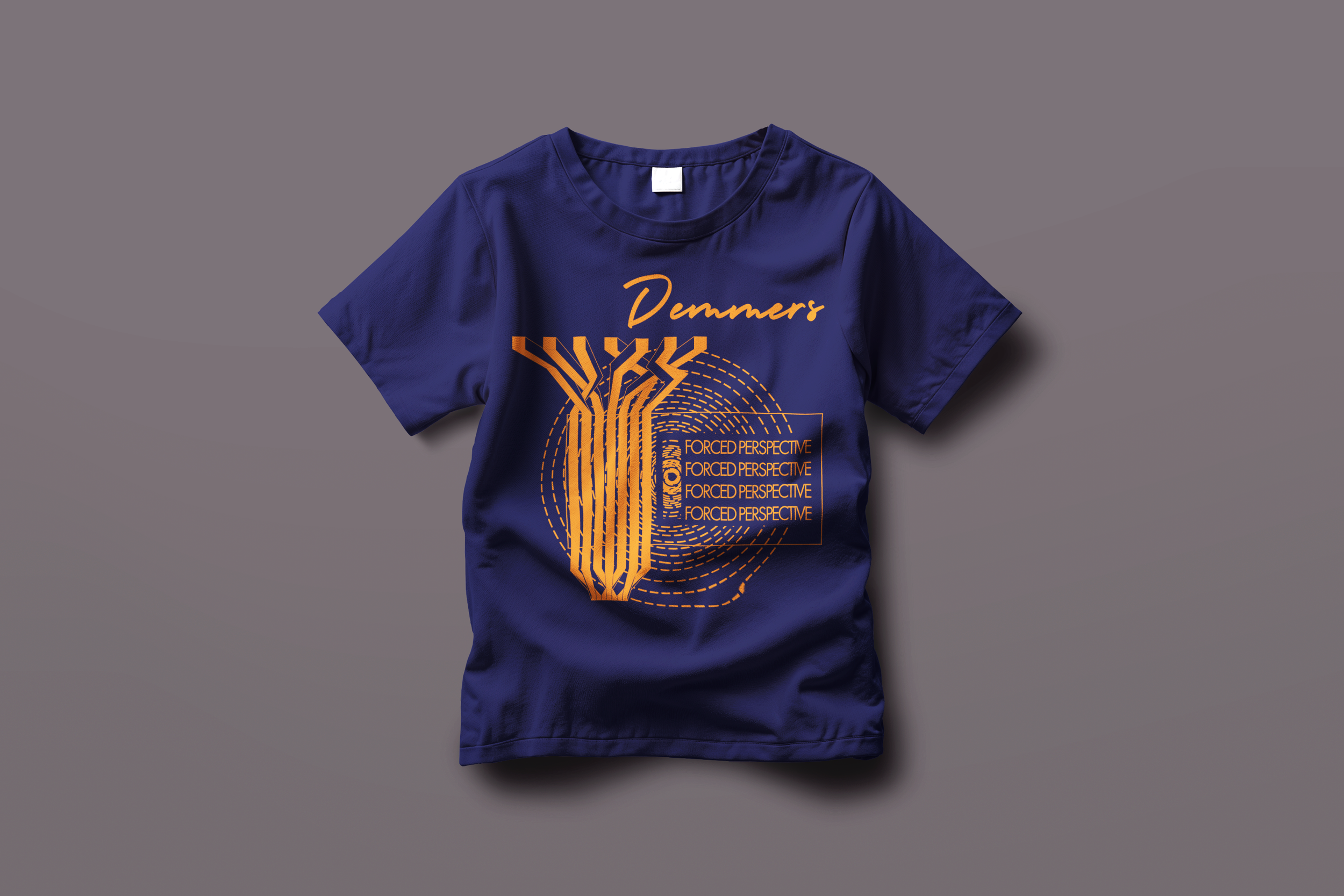
///DEMMERS_FPT
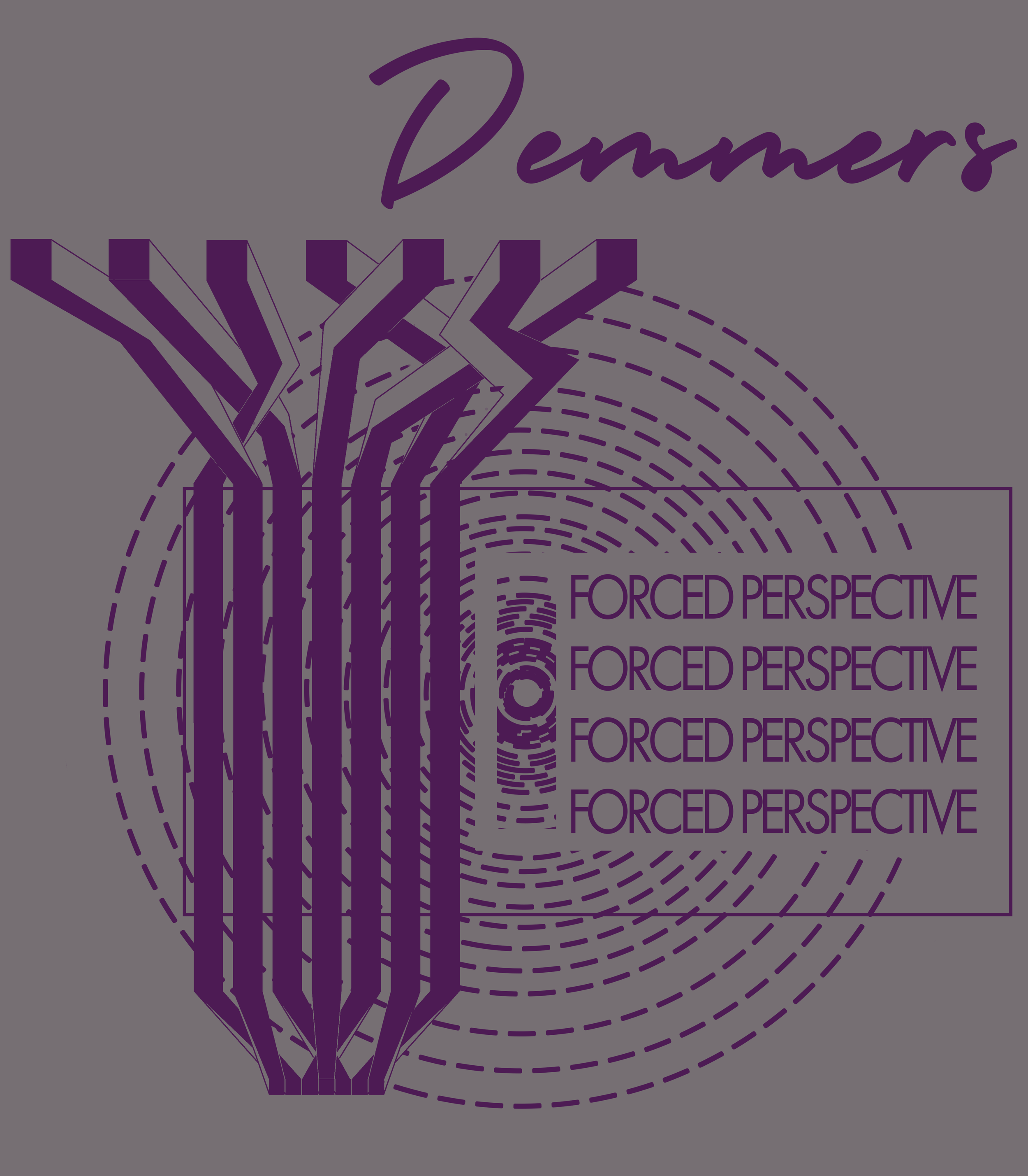
This piece translates structural typographic experimentation into wearable form. Angular letterforms intersect with concentric motion graphics to generate depth without relying on tonal contrast alone. The composition is layered but grid-conscious, treating the shirt surface as an architectural plane rather than a flat canvas. Repetition of “Forced Perspective” operates as both title and visual echo, reinforcing concept through structure. The result is assertive but controlled — a graphic system adapted for apparel.

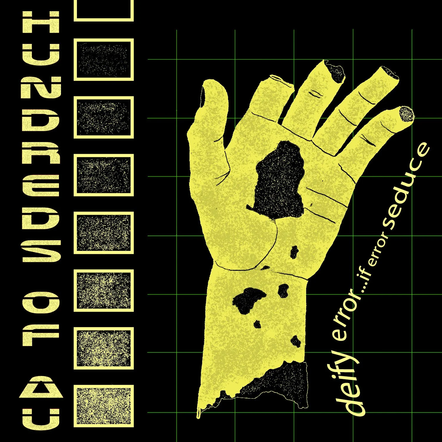
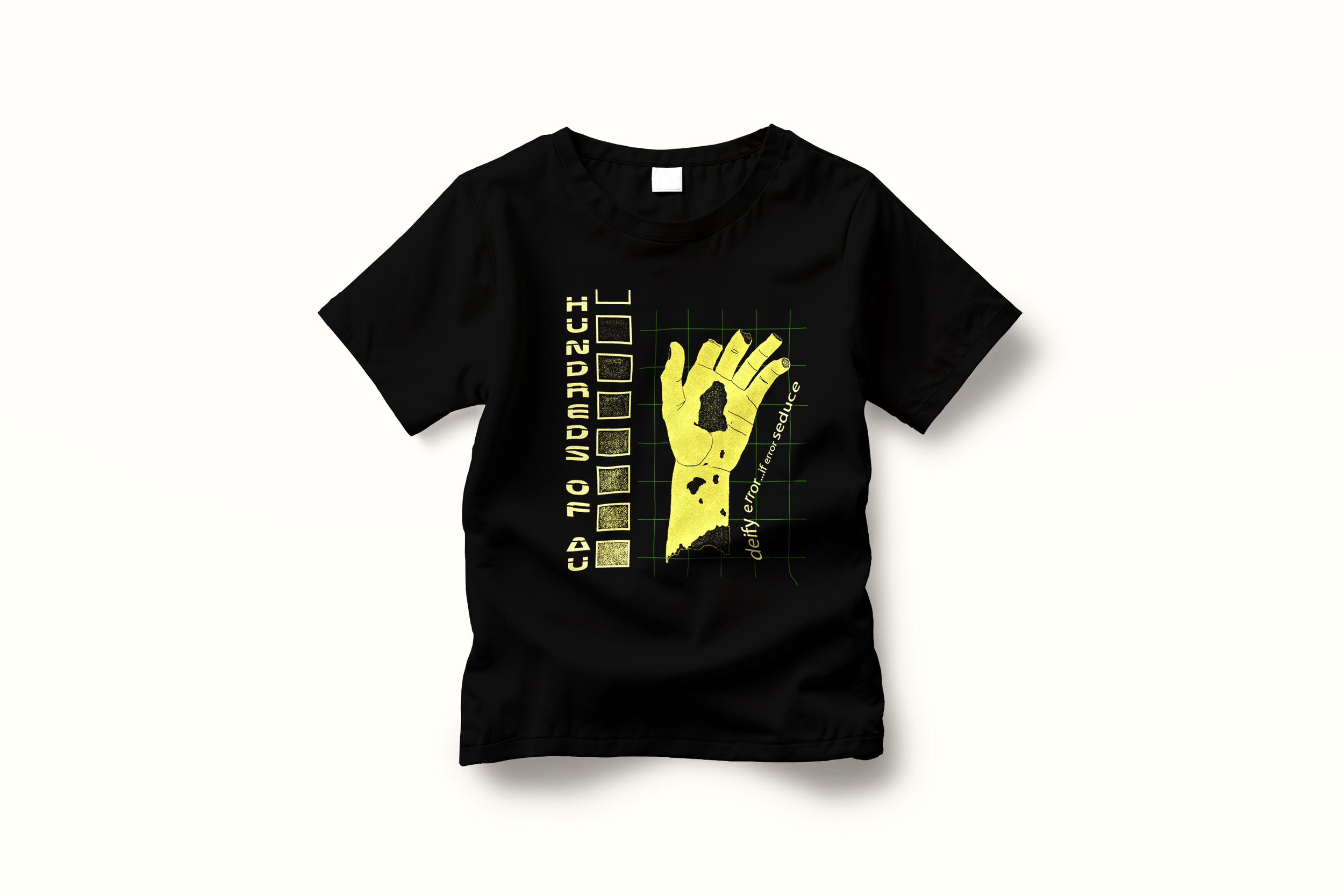
///HOAU_BLOODTHIRSTY
This design centers on a singular, confrontational silhouette rendered in high-contrast monochrome for maximum print impact. The hand functions as both icon and texture field, with granular distressing integrated into the form rather than applied as surface effect. Vertical typography reinforces a utilitarian structure, while the underlying grid subtly frames the composition without becoming decorative. The piece prioritizes immediacy and legibility at distance while maintaining enough detail to reward close inspection. Built for wear, not just display.
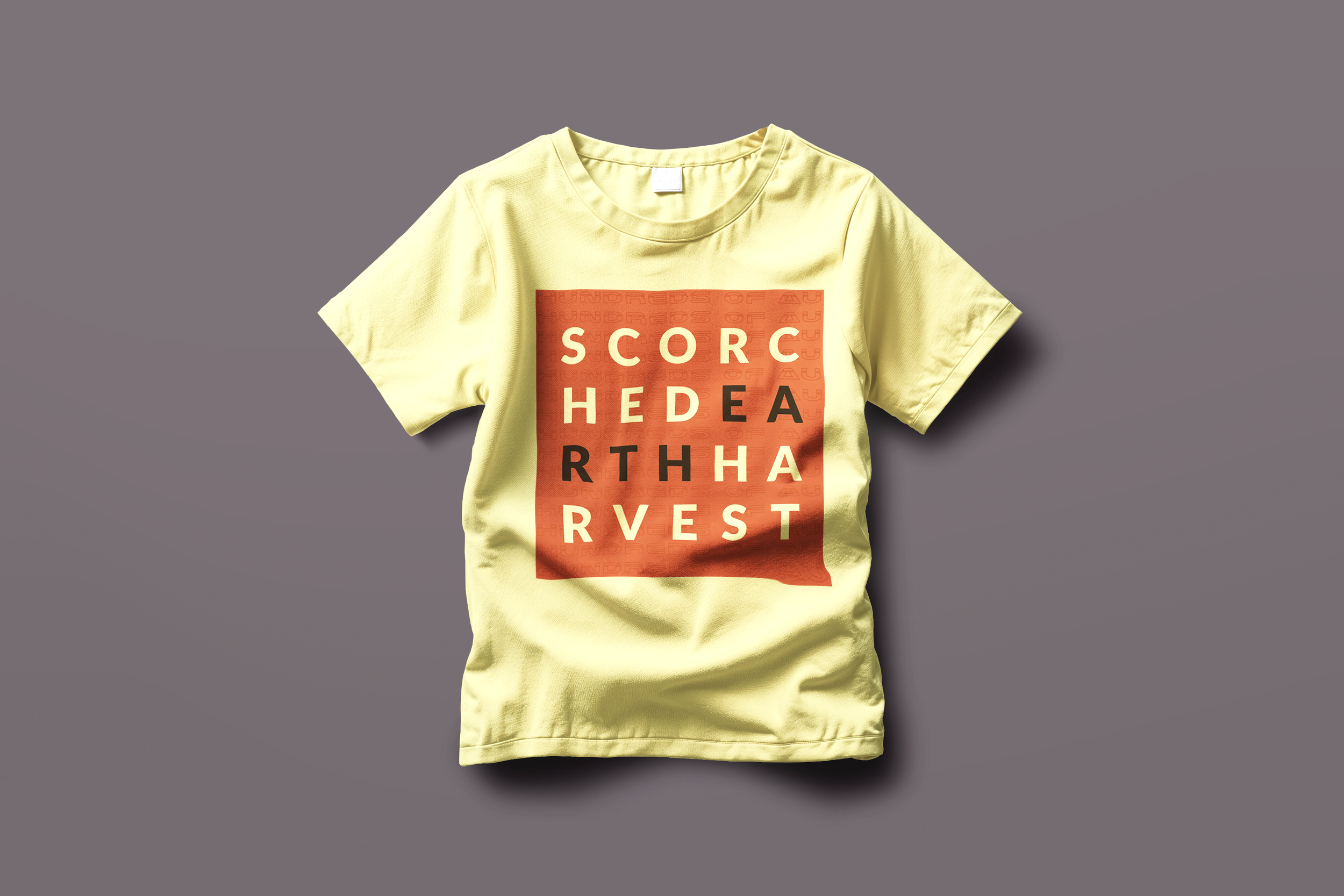
///HOAU_SCORCHED EARTH HARVEST
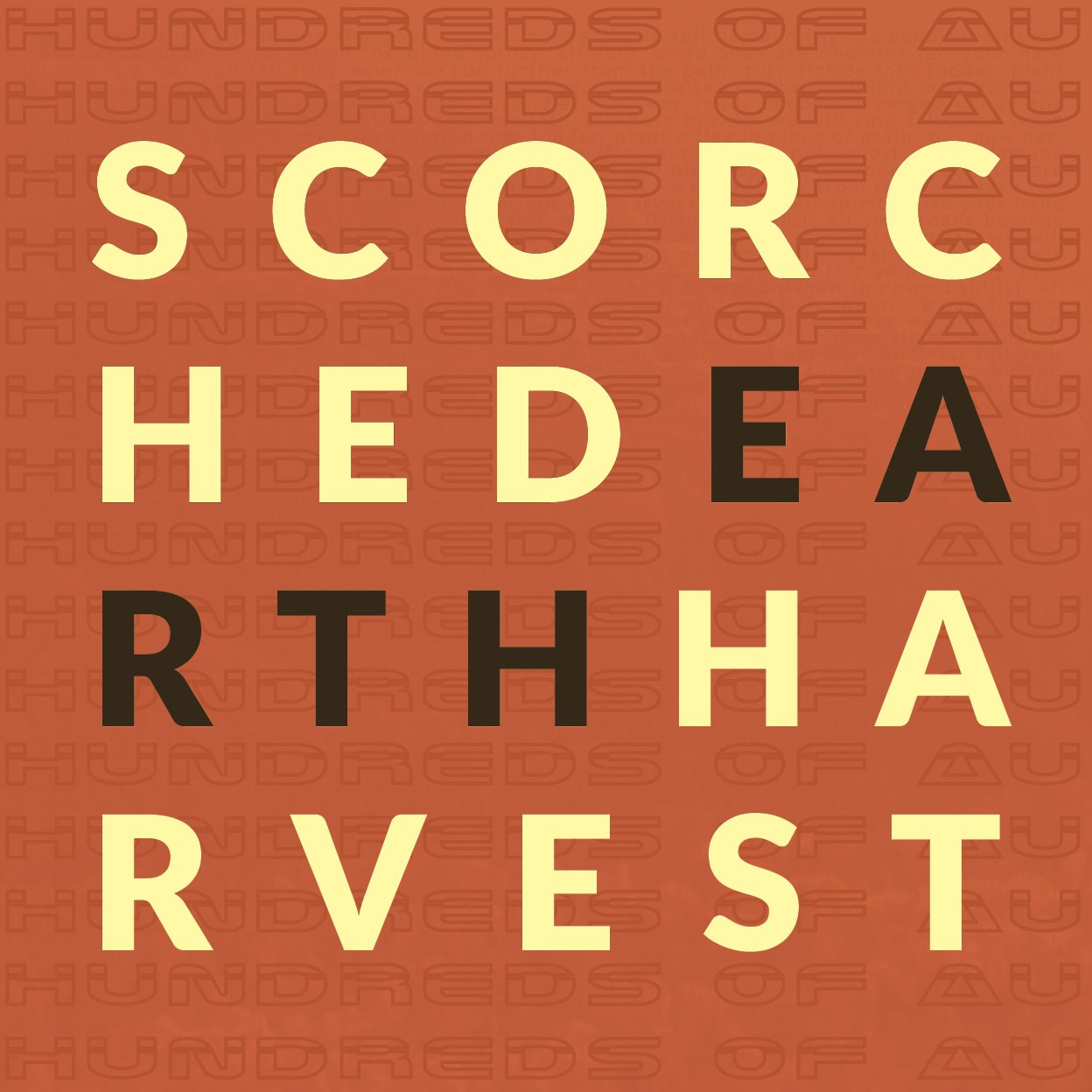
This typographic-forward design builds authority through scale and repetition. Oversized letterforms dominate the surface, while a tonal background pattern subtly reinforces identity without competing for attention. The composition rejects illustrative support, instead relying on proportion, weight, and alignment to carry the garment. It reads clearly at distance and maintains structural cohesion up close. Designed to function as a bold declarative statement rather than a narrative graphic.