
6.5.26
Hi! Thanks for checking out my blog. My previous post outlined some work I had been working on through March and April, so if you haven’t checked it out, please do.
You’re going to have to pardon my lack of blog etiquette, but I never really know how to start these posts. I can say that I have been very busy developing new professional skills while working on projects that I’m so thankful to be a part of. Between client work, portfolio development, and continuing to refine my process, the last couple of months have been packed.
The last project I completed is one that I am extremely proud of. Kevin Oakley is trying to turn his love of photography into a professional service, and he recognized the need for a strong logo. I had previously been commissioned by Kevin for a couple of promotional flyers for car shows in Arizona. The one thing I learned from doing those flyers is that Kevin loves his car. So I wasn’t at all surprised that he wanted to include a silhouette of his pride and joy as part of his professional mark.
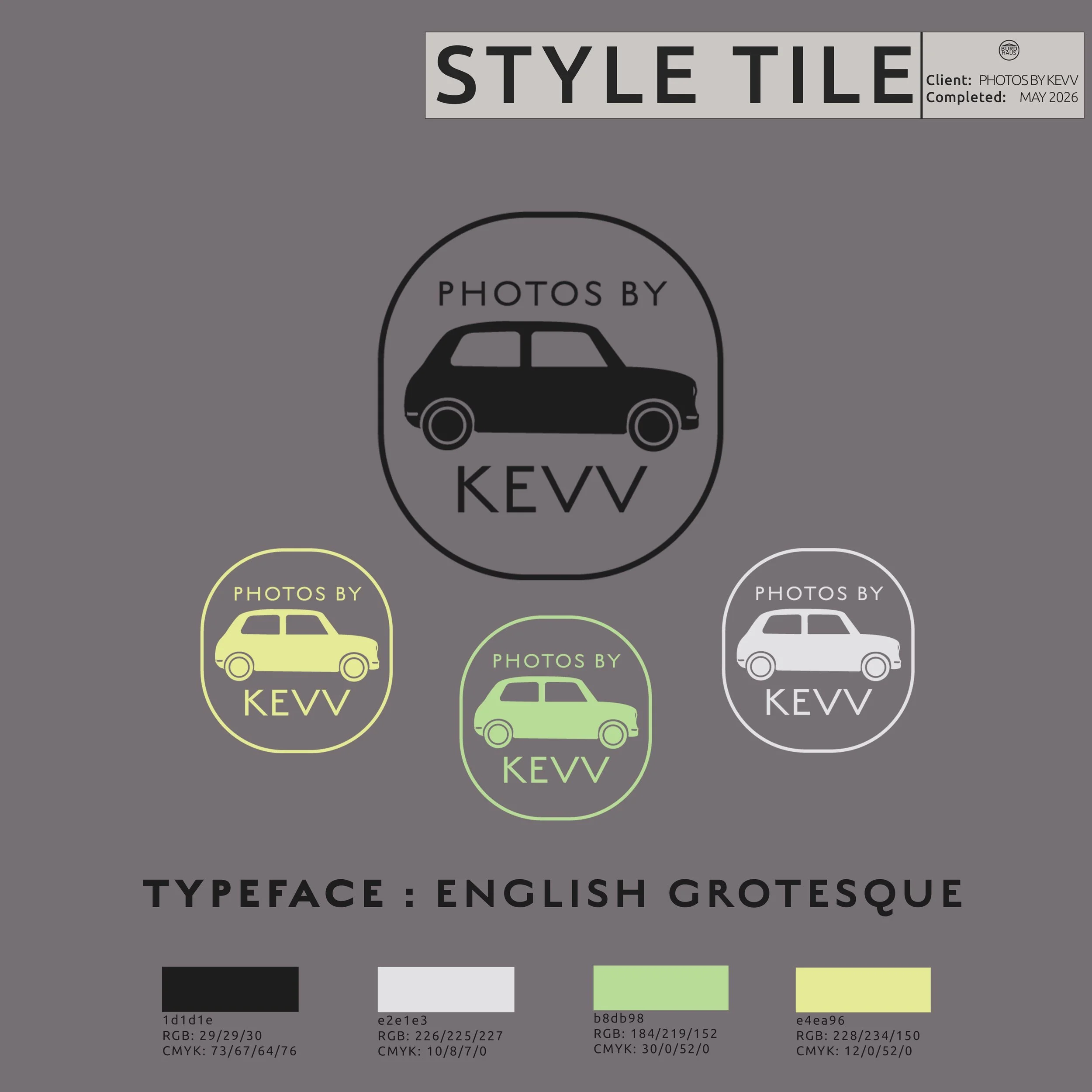
Photos By Kevin (2026)
Kevin’s logo was created using Adobe Illustrator to build a clean vector that is scalable across multiple formats. I focused on simplicity and made legibility my priority. In doing so, I was able to use this project as an opportunity to further refine my workflow. Honestly, the car looks pretty cool, and it's distinguished from other photography logos I observed while doing market research. The challenge wasn't drawing the car. The challenge was making sure it still looked like a professional photography logo and not a logo for a car club. Rather than using a cameo shape, I created a frame that suited the subject, so the end result was a rounded rectangle that evenly frames both the typography and the car. Kevin gave me liberties with both the color and type selection.
Now that the release is out, I’m allowed to post about it. Hundreds of AU released a benefit tape to raise money for Jeff Cannonball and his family following his ALS diagnosis. The weight of this project was a lot. I thought it best to go a bit further than I normally do, so I got in my car in the February cold and went looking for photogenic landscapes in the beautiful hills of Sussex County, NJ. I found one near Augusta and snapped a dozen or so pictures that I thought would fit the emotional weight of the music.
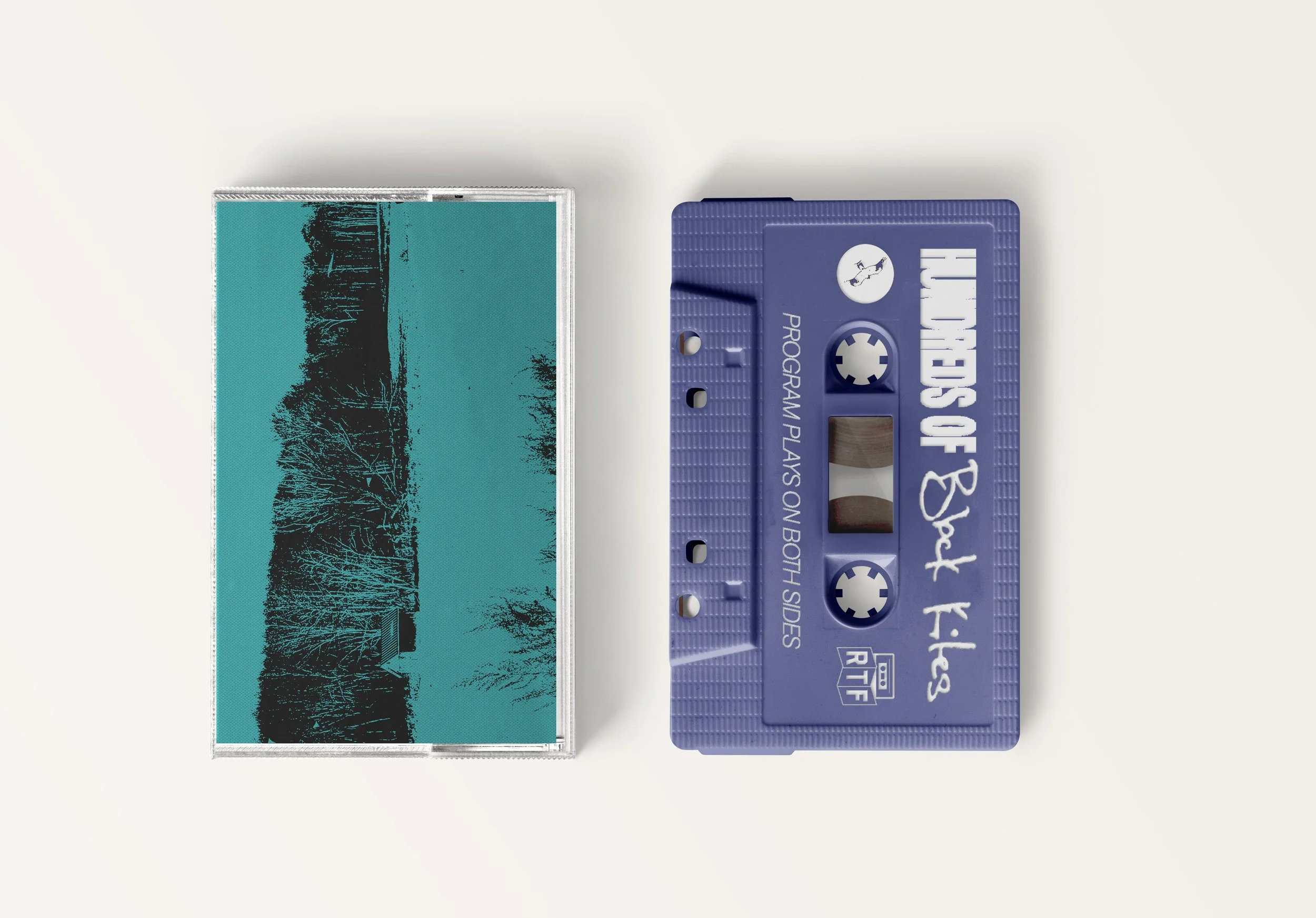
Hundreds of Black Kites (2026)
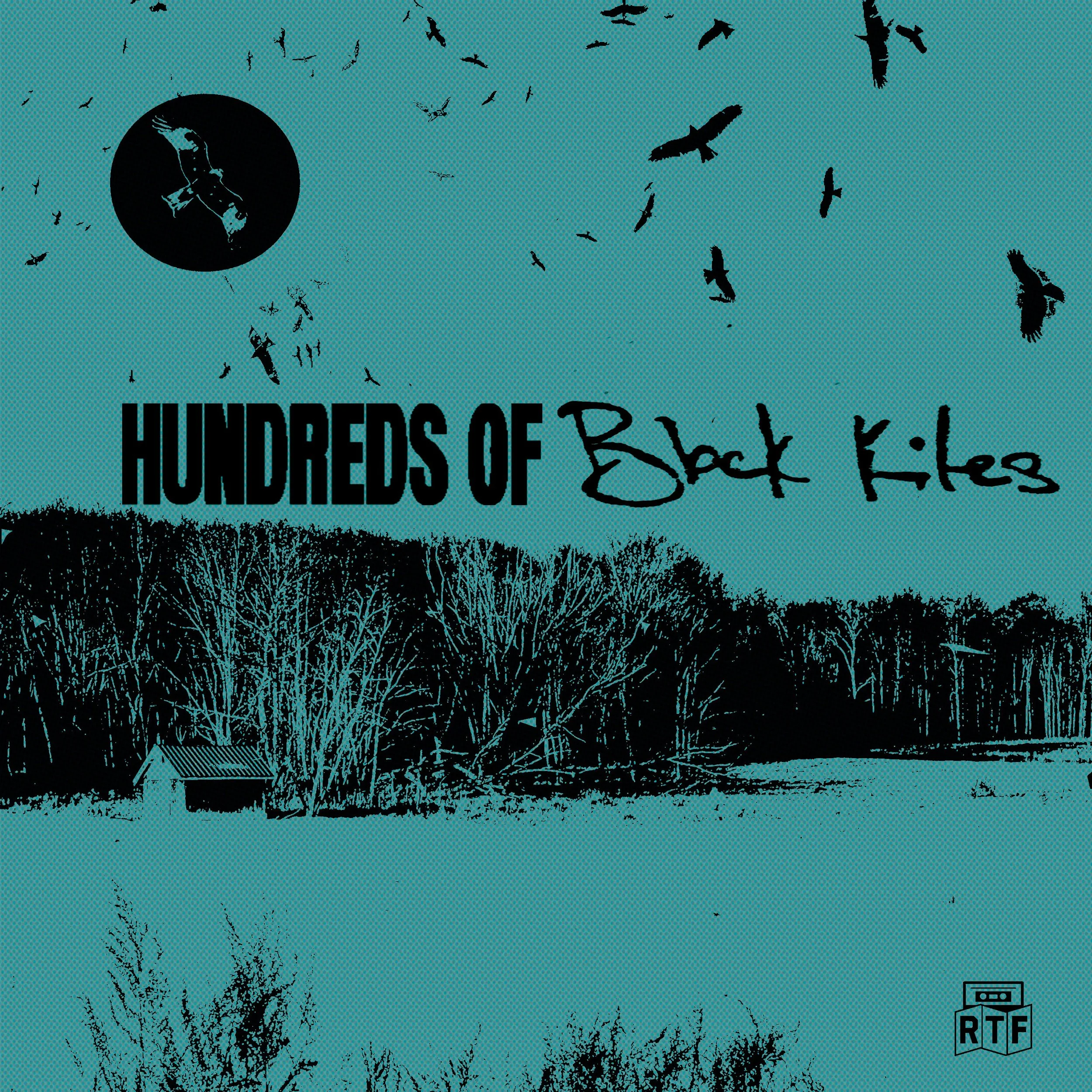


I could have pulled a stock image from the internet, but this project didn't feel like the kind of thing that deserved shortcuts. Through the use of distressed textures and high contrast, I was able to create a cohesive release identity anchored by an original logo and the tension created by the duality of the two different typefaces used in the release title.
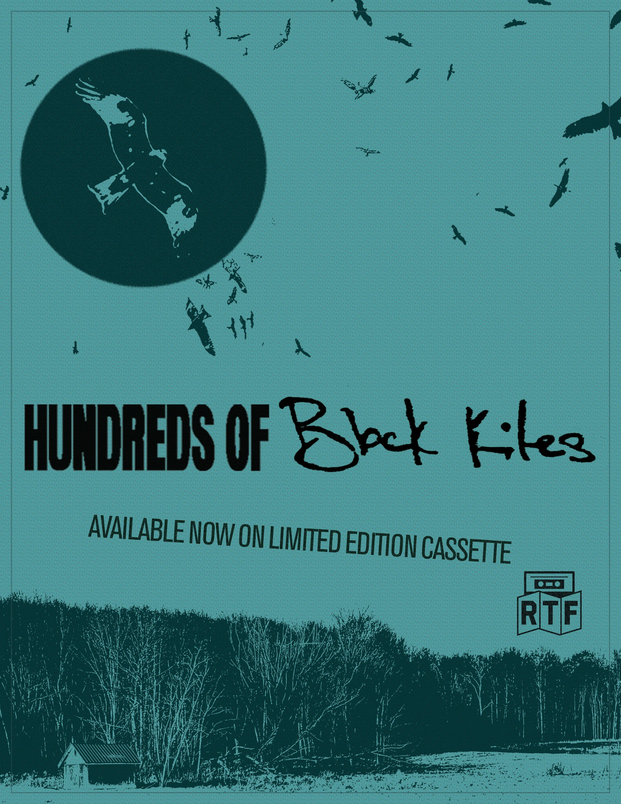
Hundreds Of Black Kites - Promotional Poster (2026)
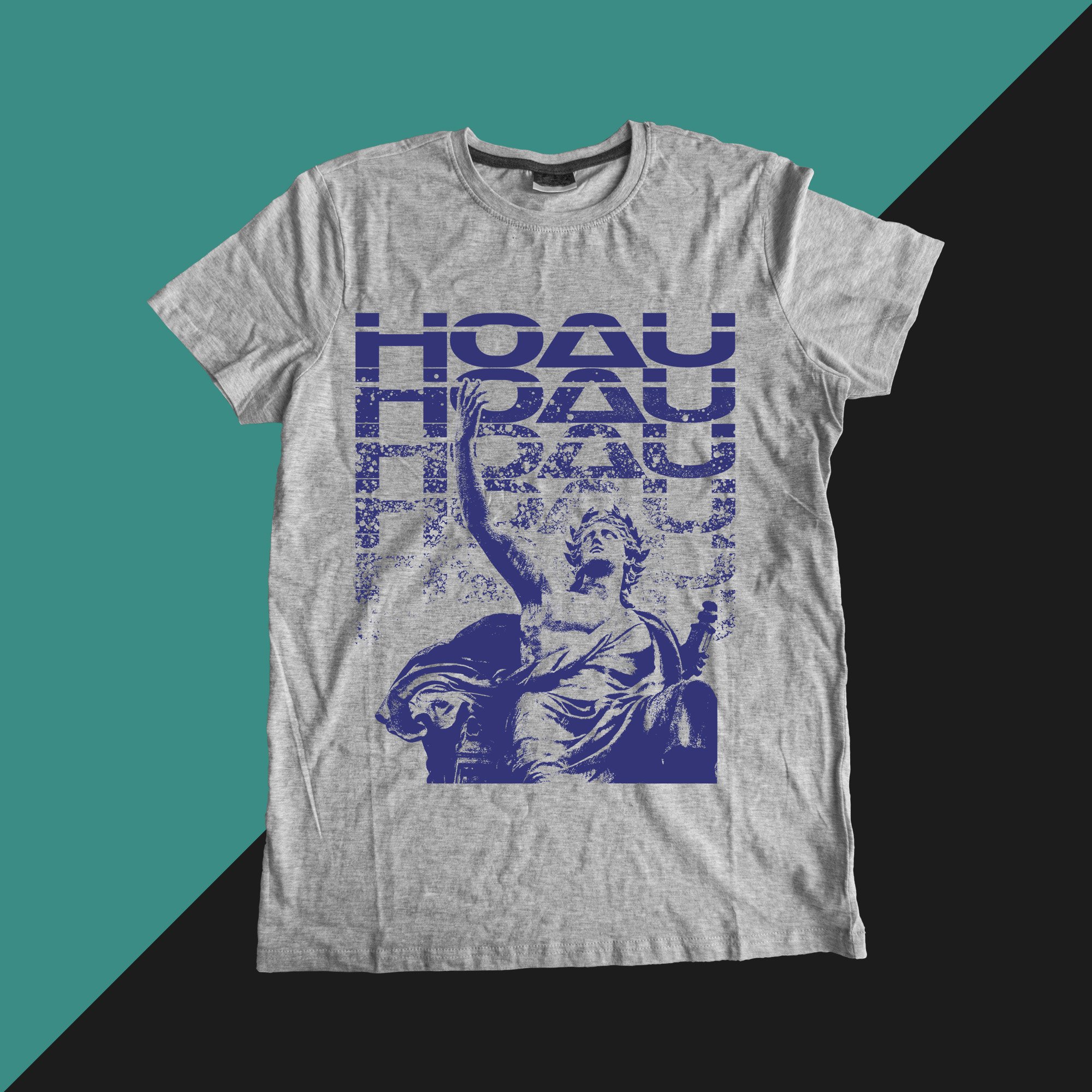
In keeping with Hundreds Of AU, I put together a one-color shirt design that ended up being printed on heather gray t-shirts using royal blue ink. HOAU has been using a futuristic typeface called “Laserian” since their inception. It presents challenges when you want to include elements that don’t fit a futuristic vibe, like a classical sculpture. By creating a stack of HOAU and degrading each row further until it begins to disappear, I was able to take these two contrasting pieces and integrate them without creating design-breaking tension.
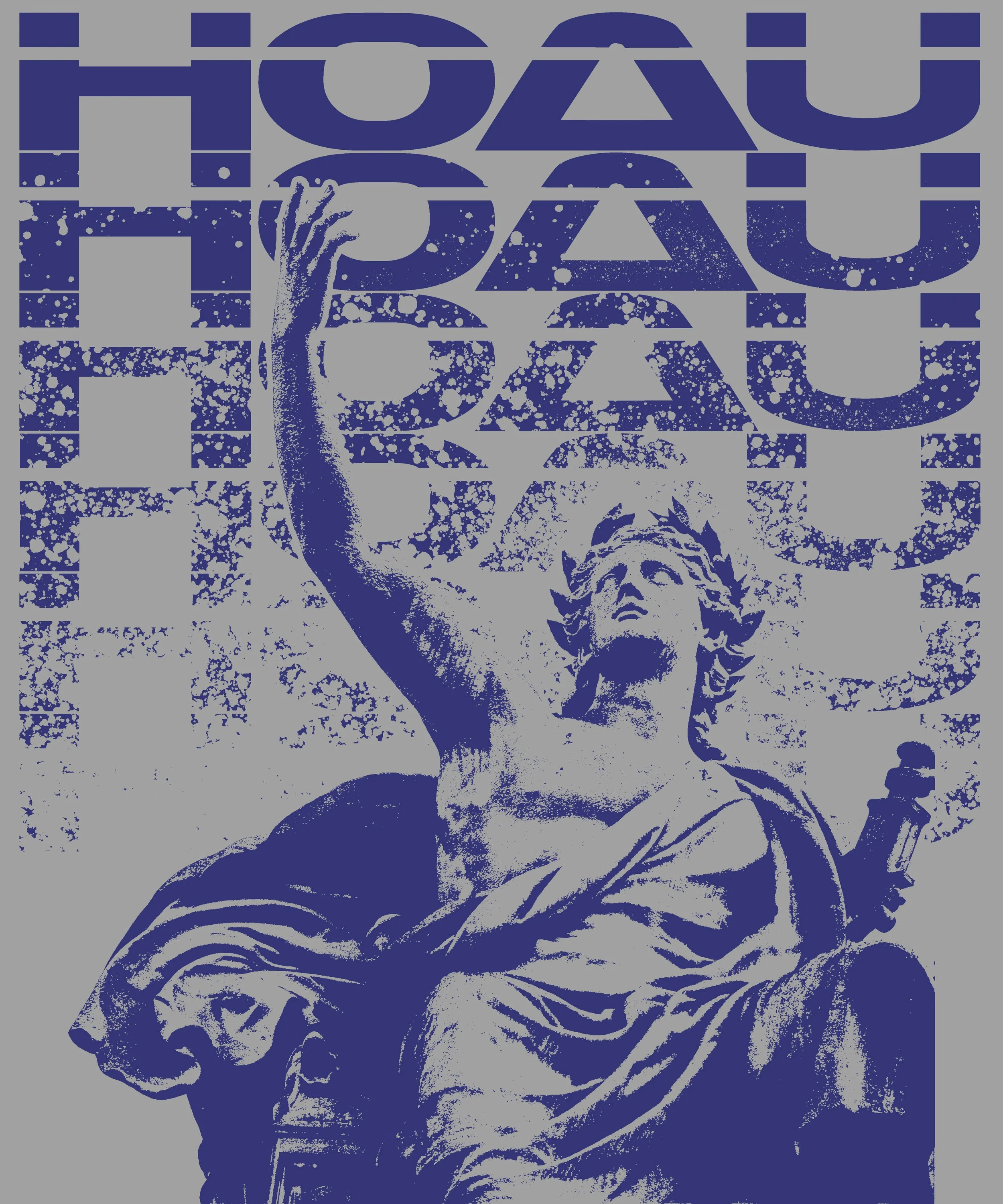
Hundreds Of AU (2026)
Sometimes design problems aren't solved by adding more elements. Sometimes they're solved by finding common ground between elements that shouldn't work together.
(mockup)
This Urban Waste flyer was one of my favorites to work on. The client wanted something highly visual that stayed simple while representing Americana. Nothing screams "look at me" like certain shades of yellow. In particular, this darker pastel is soft and fun, like the image itself, but still holds contrast well. I tried different colors but kept coming back to the yellow. It resembles a lot of flyers from my youth.
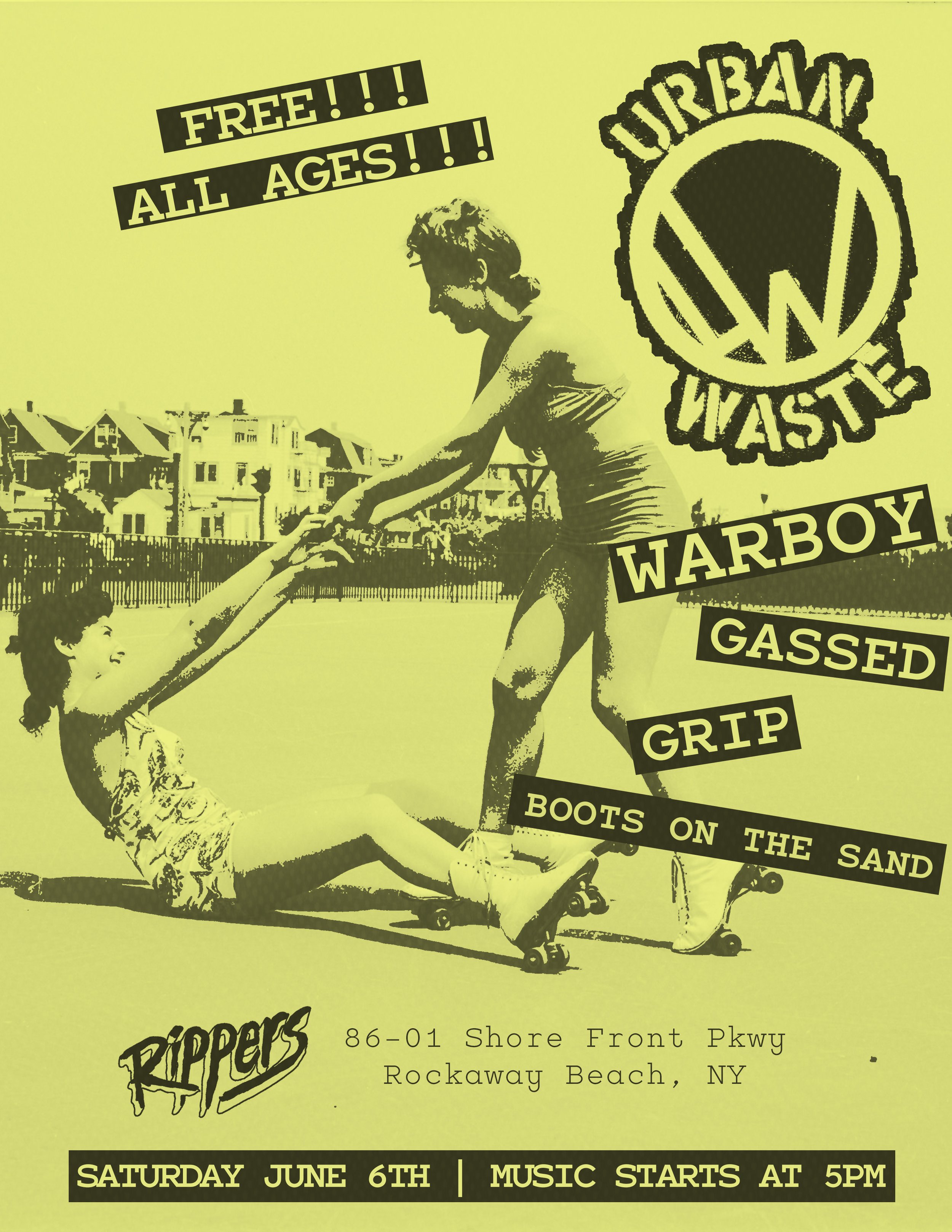
(2026)
I remember making one in high school where I used stickers, a hand-punch label maker, and cut strips of paper. Before Photoshop, before Illustrator, before I knew what hierarchy was, I was cutting up paper, using stickers, and making flyers for local bands. This one feels connected to those early experiments. I went back to who I was making those local flyers when I pieced this one together. You know exactly what this is just by looking at it.
This last one, I loved doing. I’m a huge fan of Bullshit Detector, so it was really fun to put together this flyer for a show they are playing in DC. The whole design is built around a vintage photo of a skinhead. For this one, I maintained that restrained color palette, though recently it’s probably the most color I’ve used in any of my designs. The creamy off-white sits on the blue really well.
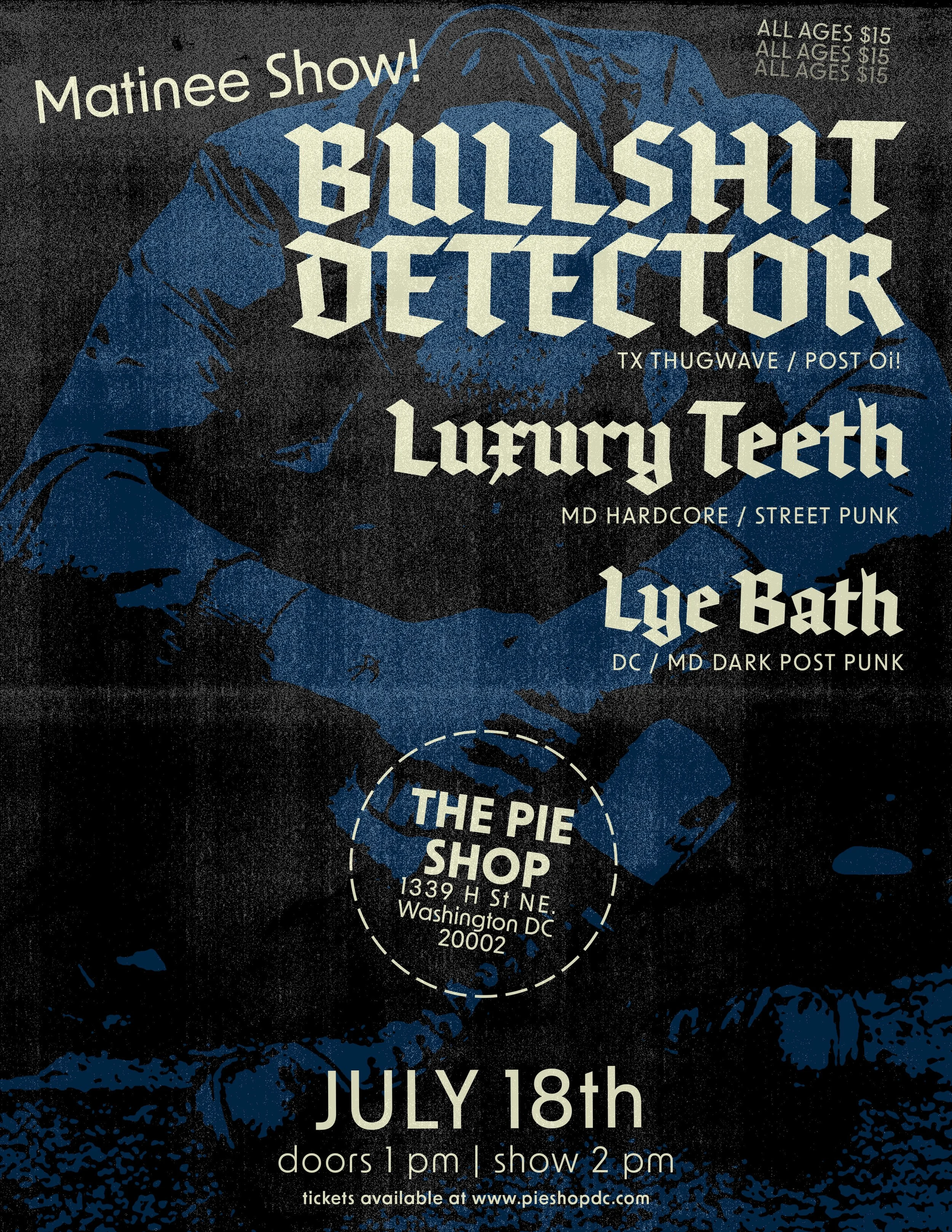
Bullshit Detector (2026)
I tried to restrain the typography as well and kept it to just two typefaces: a heavy blackletter and multiple variants of a clean sans serif. Personally, I think all of the aggression in the flyer is found in the texture and the typeface I used for the bands. Because I wasn’t given a logo for the venue, I had to improvise, and I did so by creating a dashed circle and balancing multiple weights and sizes of the sans serif.
What I like most about this one is that it accomplishes a lot without actually being all that complicated. This is a hierarchy-heavy piece. The visual isn’t complicated, but the information flow is doing a lot of work.
Looking at all of this work together, I'm starting to notice a pattern. Whether it's a logo, a flyer, a shirt, or a cassette package, I'm spending less time trying to make things louder and more time trying to make them clearer.
Thanks for taking the time to read and catch up with me. There will be plenty more posts coming. In the meantime, please fee free to CONTACT ME.
Brian J. Burdzy
artist/designer