
print designs///
///OUTSIDER_5.29
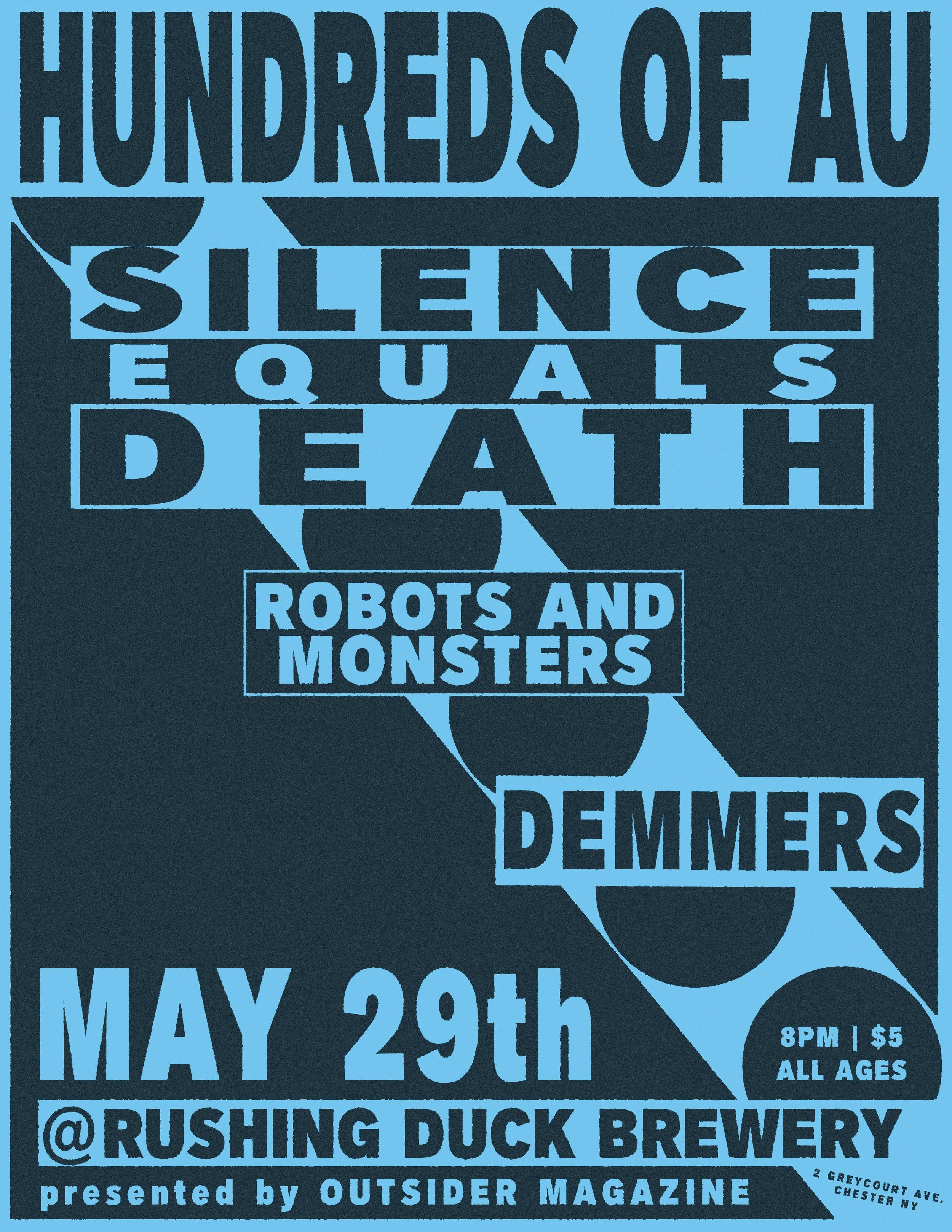
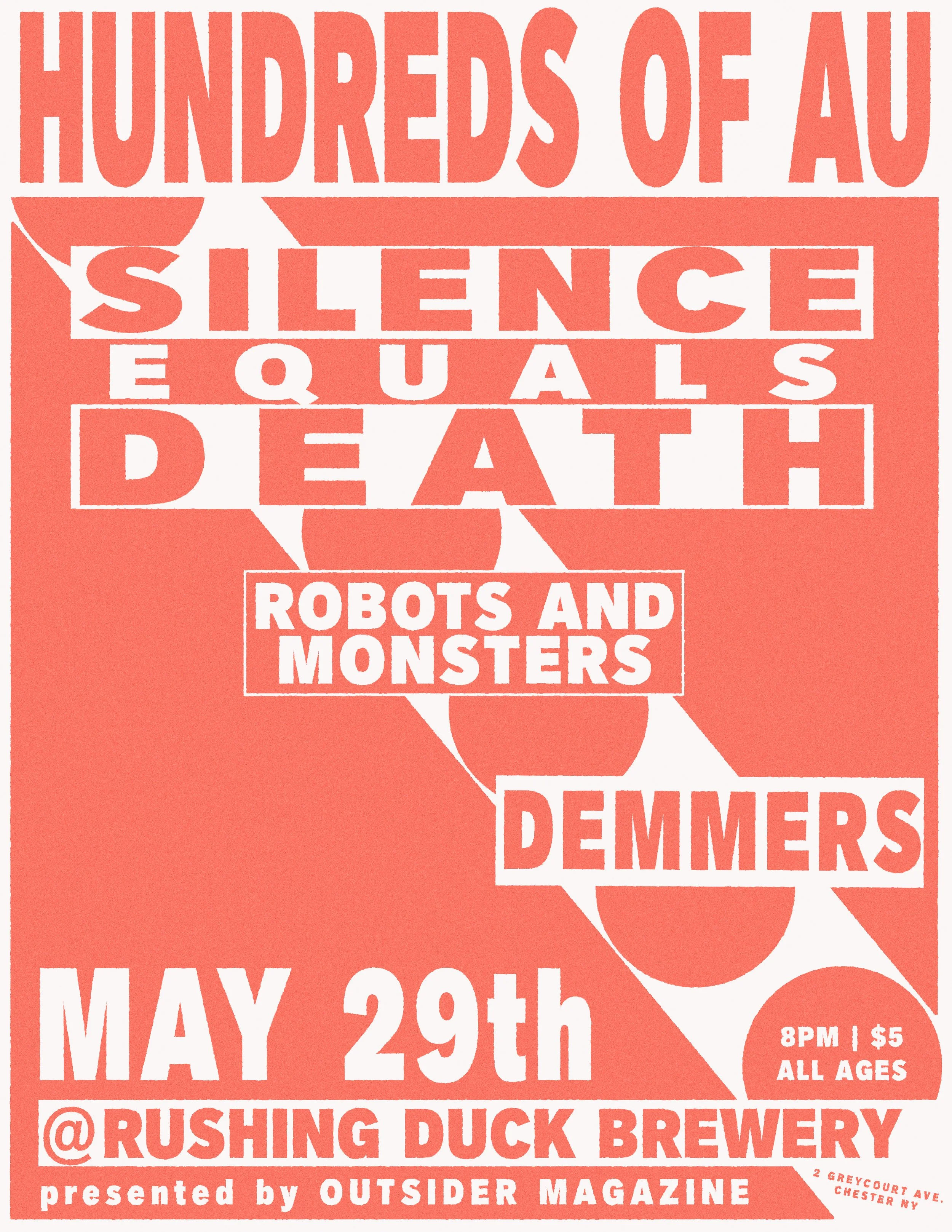
Poster series developed for a live event presented by Outsider Magazine, exploring how limited structural systems can generate multiple distinct visual outcomes through color and inversion alone. Both pieces were built from the same underlying composition, using aggressive geometric typography, interlocking forms, and constrained spatial organization to create a unified visual identity across the series.
Rather than redesigning the layout between versions, the project focused on how palette shifts, positive/negative inversion, and figure-ground relationships could completely alter the emotional tone of the work while preserving hierarchy and readability. The final selected posters demonstrate a system-driven approach to layout design, where repetition and constraint become tools for variation rather than limitation.
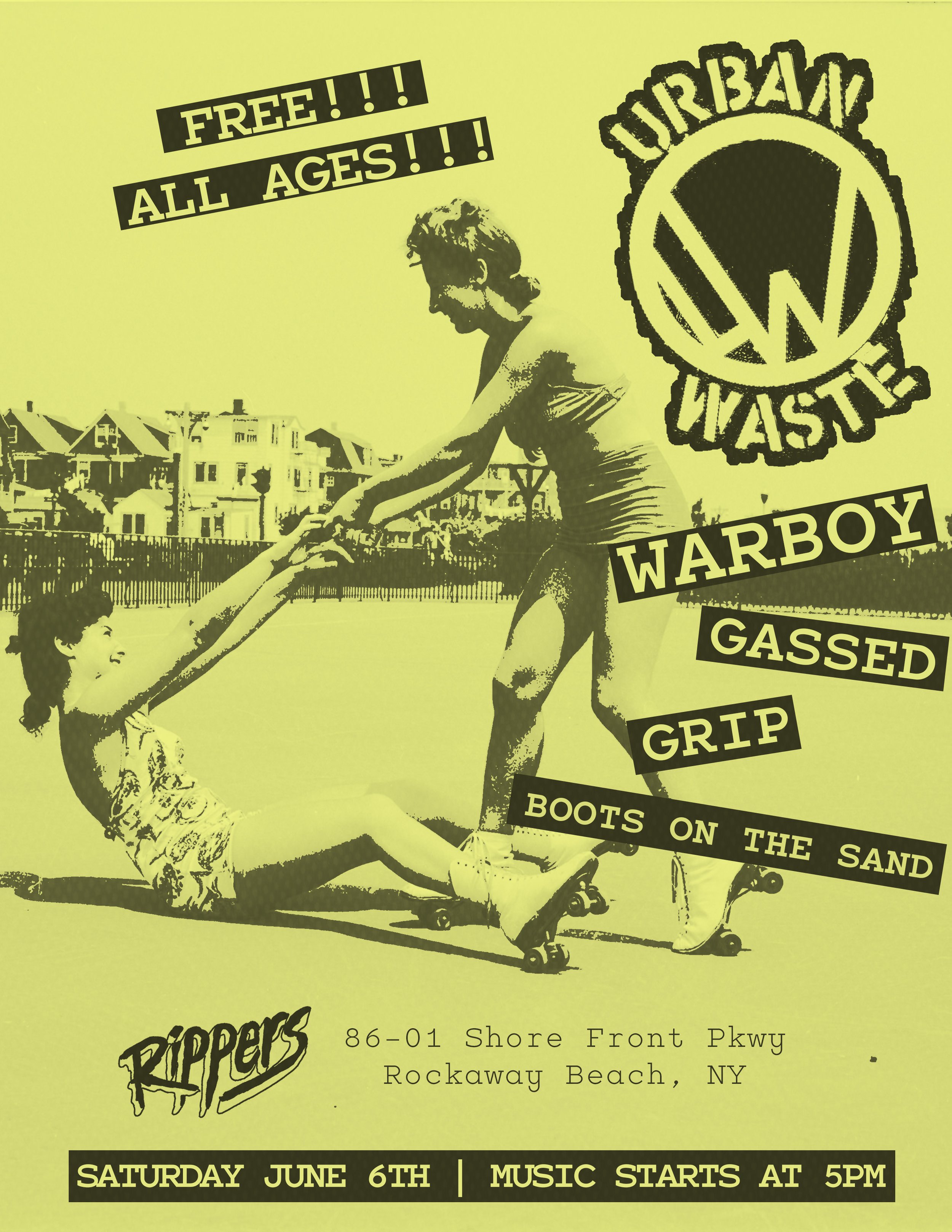
Promotional flyer created for a multi-band hardcore show at Rockaway Beach, built around degraded photography, aggressive contrast, and intentionally unstable typography. The layout combines cut-and-paste punk flyer traditions with a more controlled compositional structure, using angled text blocks and asymmetrical placement to create movement without sacrificing readability.
The piece uses stark black imagery against a faded sun-bleached background to create a weathered and deteriorated atmosphere that reflects both the coastal setting and the physical quality of photocopied DIY show flyers. Distressed textures and heavily processed photography were used to unify the composition while preserving strong hierarchy and immediate readability across both print and digital formats.
///gassed_6.06

///DEMMERS_3.21
This flyer integrates hand-rendered illustration within a controlled layout framework. The drawing establishes character and tonal direction, while structured typography maintains compositional order. Imperfections within the line work are preserved as deliberate formal elements rather than corrected, reinforcing authorship without disrupting hierarchy. The composition demonstrates balance between expressive mark-making and typographic discipline.
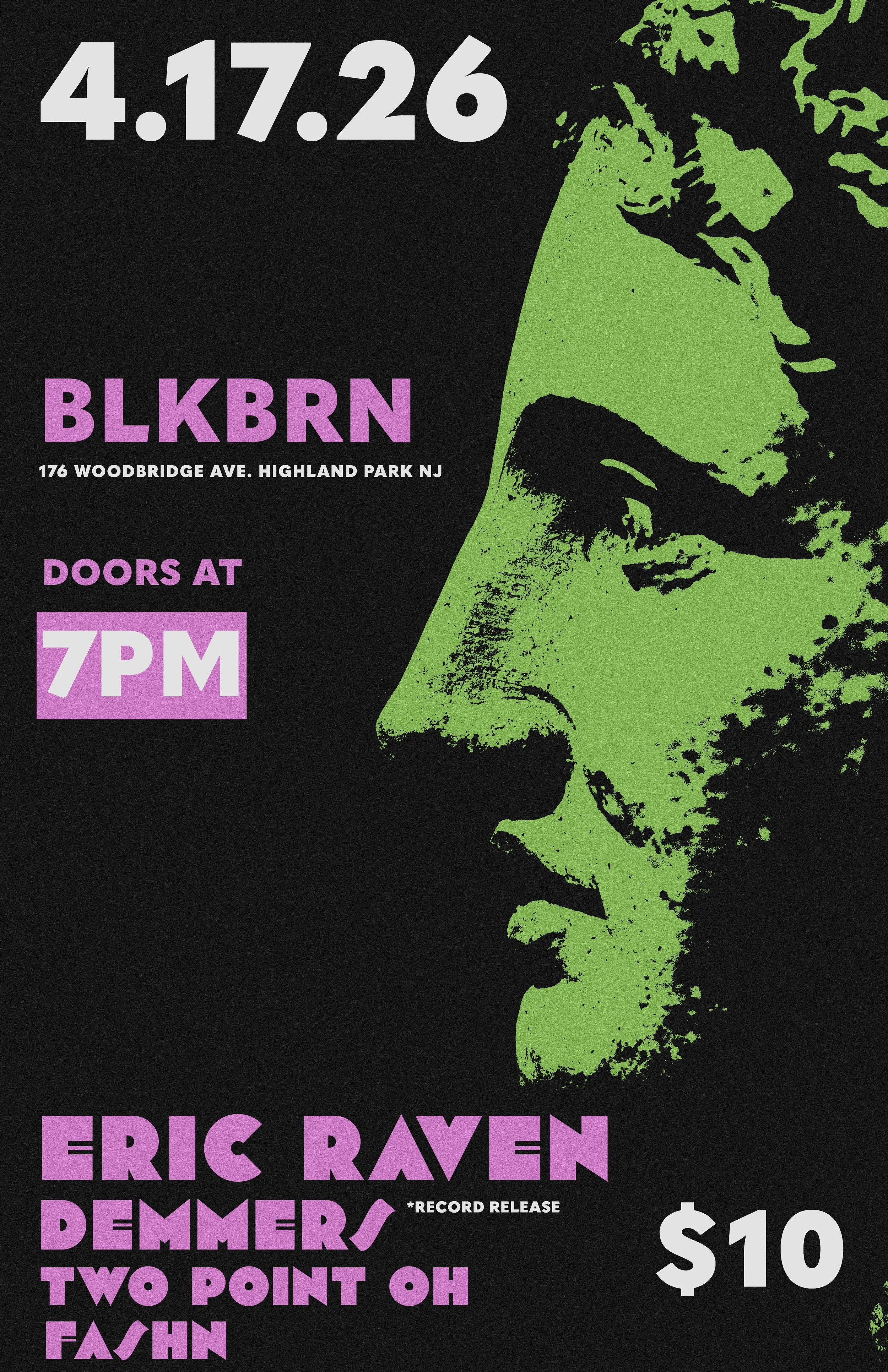
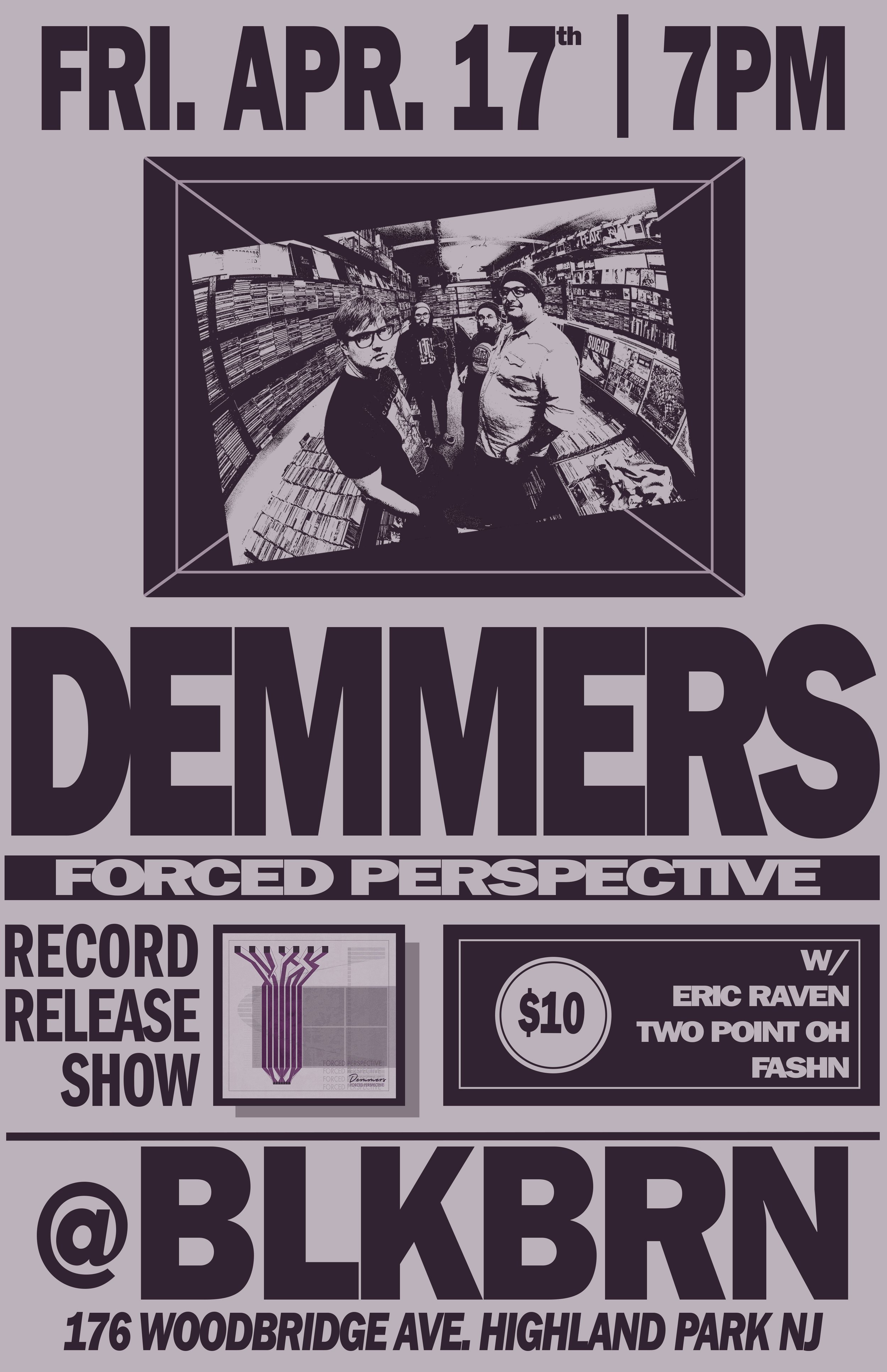
///DEMMERS_4.17
This piece builds impact through high-contrast color and tightly controlled cropping. A compressed facial profile anchors the composition, counterbalanced by a disciplined vertical typographic column. Information is organized through proportion and spacing rather than scale alone, allowing hierarchy to emerge without excess. Asymmetry and negative space create structural tension while preserving clarity. The composition prioritizes immediacy without compromising formal control.
///DEMMERS_4.17_ALT1
This typographic-forward variant is constructed around oversized industrial letterforms and modular information blocks that treat event details as architectural components. The scale relationships and horizontal banding recall mid-century event ephemera while maintaining contemporary clarity and weight. Rather than relying on imagery for impact, the composition builds authority through proportion, spacing, and structural rhythm. The result is a disciplined, system-driven layout that feels both grounded in historical precedent and confidently modern.
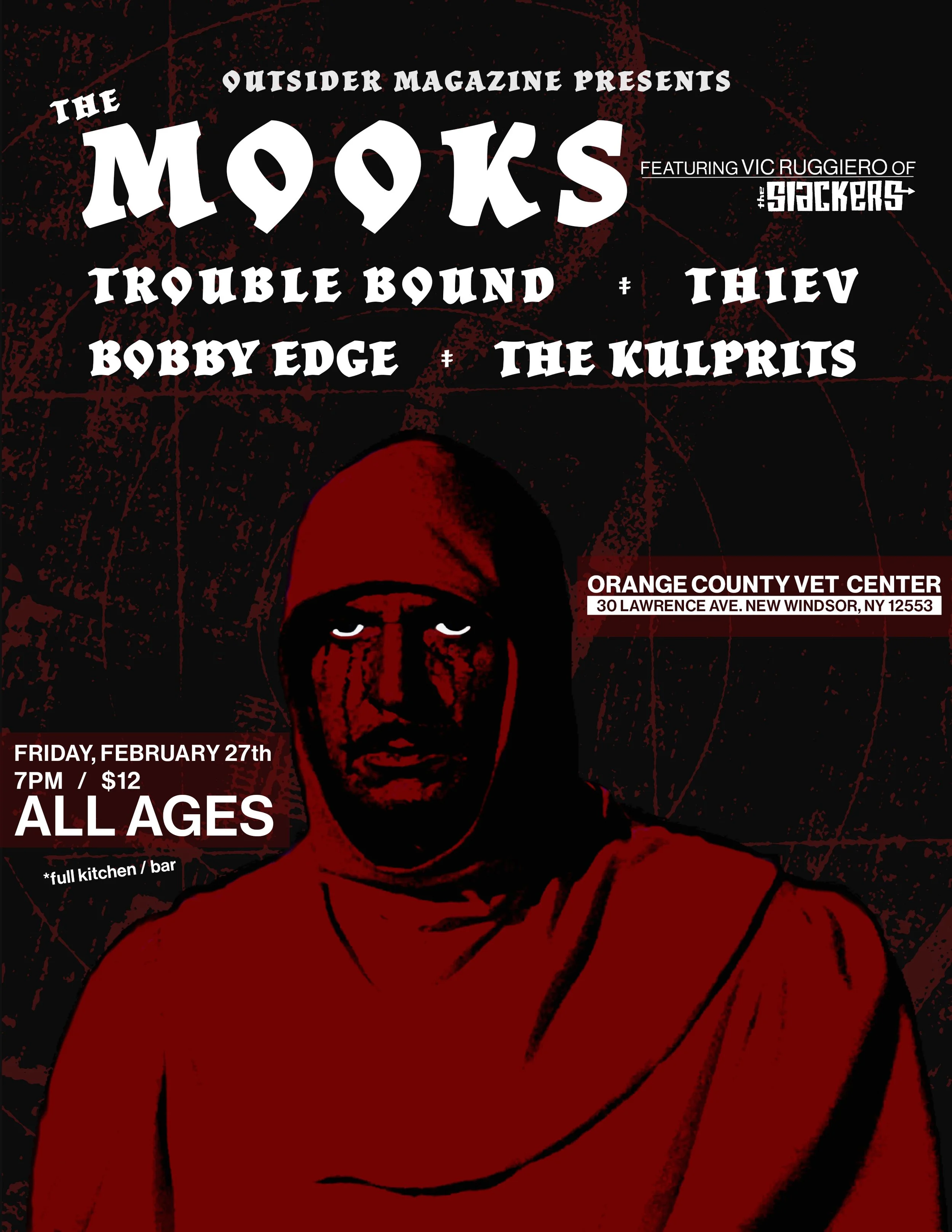
///OUTSIDER_2.27
The limited red-and-black palette establishes a unified visual field, allowing tonal weight to drive the composition. The central figure functions as both focal point and structural anchor, while distressed typography introduces controlled textural contrast. Hierarchy remains direct and utilitarian, ensuring legibility within a visually compressed environment. The result balances atmosphere with disciplined information architecture.
///OUTSIDER_4.10
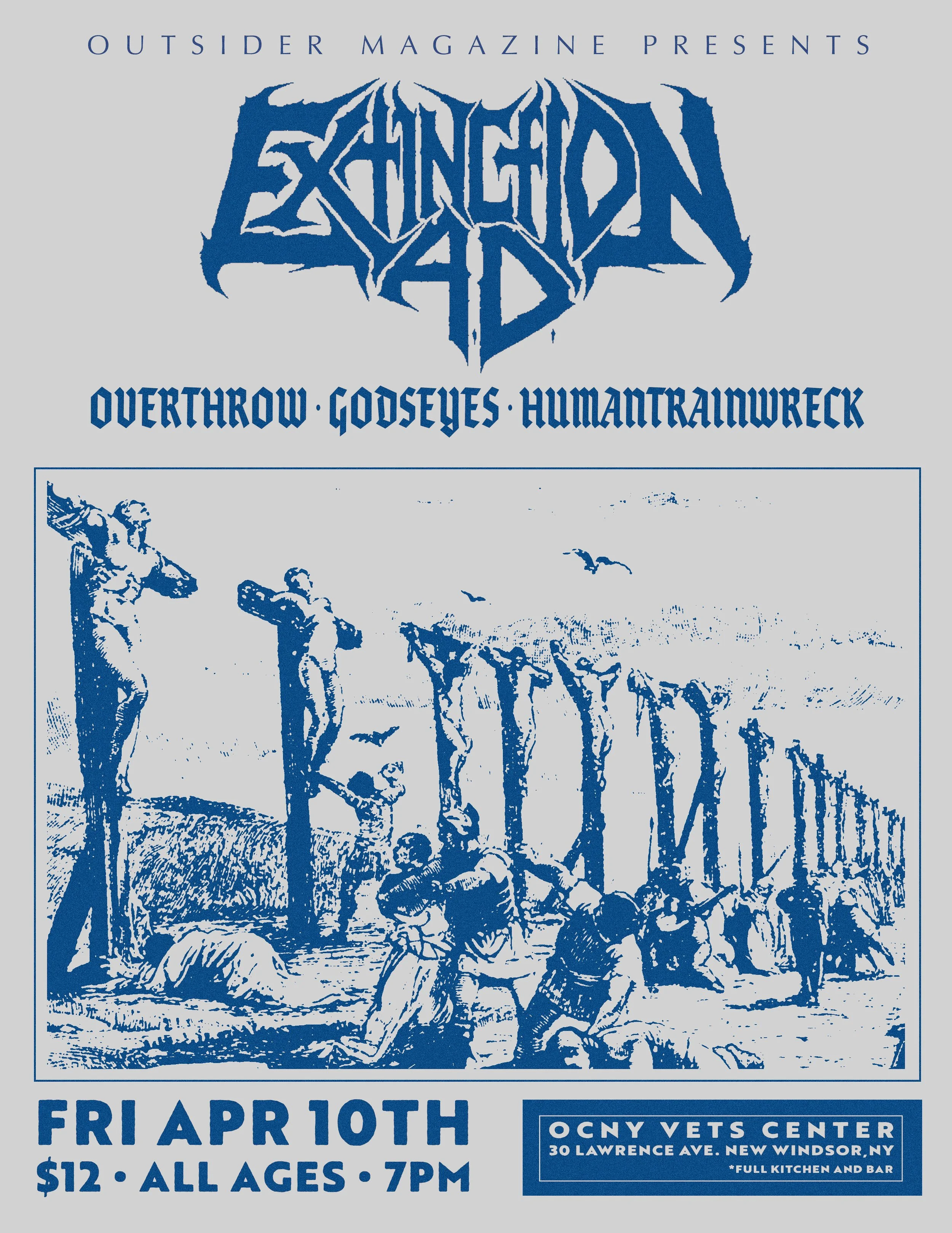
This design pairs historical religious imagery with angular typographic forms to generate visual contrast. A monochromatic blue treatment unifies image and type into a cohesive surface, while a structured lower information band stabilizes the composition. Scale relationships guide the hierarchy, allowing symbolic weight and informational clarity to coexist. The piece emphasizes restraint and balance over spectacle.
///LESSER MINDS_1.24
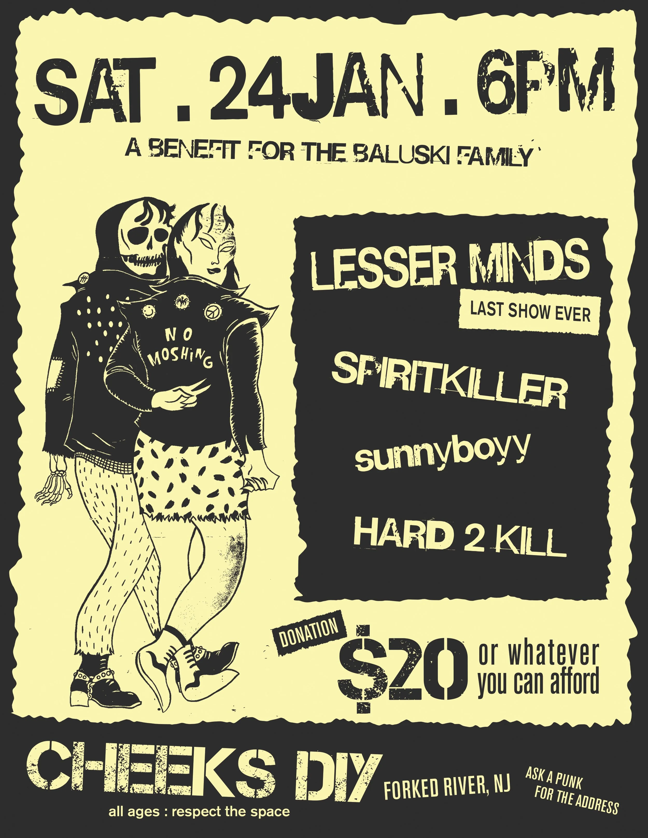
This flyer integrates original hand-drawn artwork within a restrained modular typographic system. The illustration was created specifically for this piece, serving as an organic counterpoint to the structured type layout rather than functioning as ornament. Three typefaces are deployed in deliberate hierarchy without relying on brute scale, allowing the headliner presence without overwhelming the composition. Subtle cues reference a moment of seasonal transition, embedding atmosphere without making it overt. The design balances controlled typography with intentional imperfection, merging illustration and structure into a cohesive, authored statement.
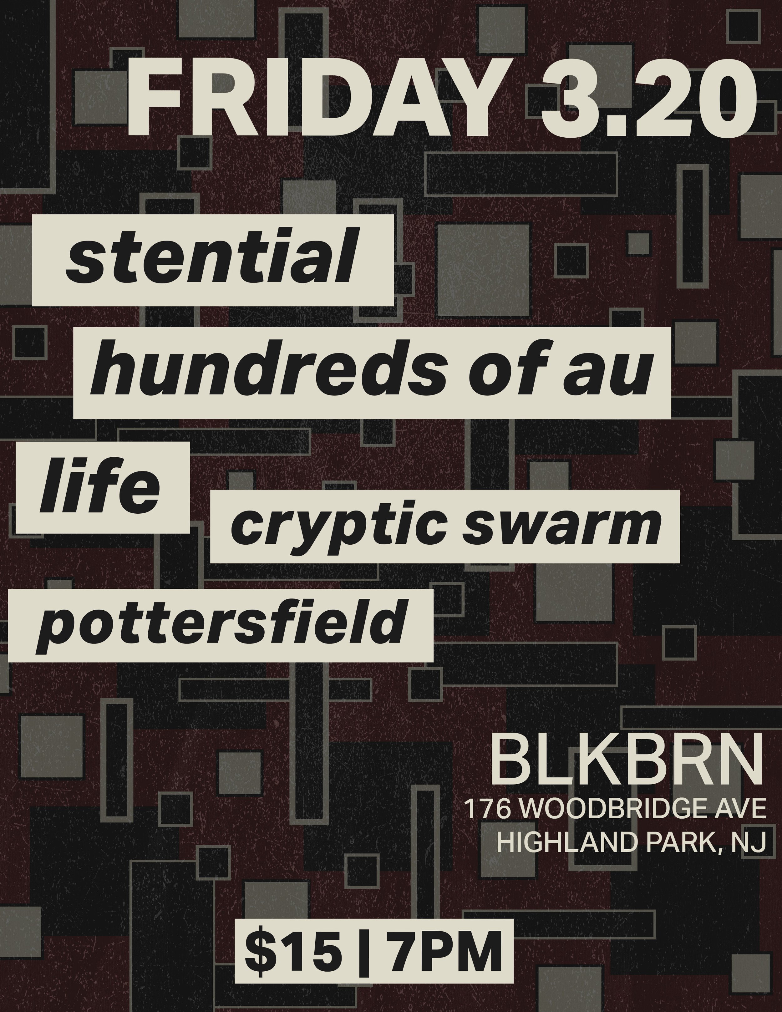
///hoau_3.20
Promotional flyer created for a mixed-genre live show using a modular geometric background system, restrained typography, and layered spatial composition to create depth without relying on illustration or photography. The layout uses repeated rectangular forms and overlapping transparency to establish rhythm and structure while allowing the event information to remain immediate and highly readable.
The project focused on balancing visual density with clarity. Italicized type blocks and asymmetrical placement introduce movement against an otherwise rigid grid system, while the restrained red, black, and off-white palette creates a darker and more atmospheric tone without overpowering the hierarchy. Designed for both digital circulation and physical promotion, the piece emphasizes controlled composition, repeatable systems, and strong information design within a limited visual language.
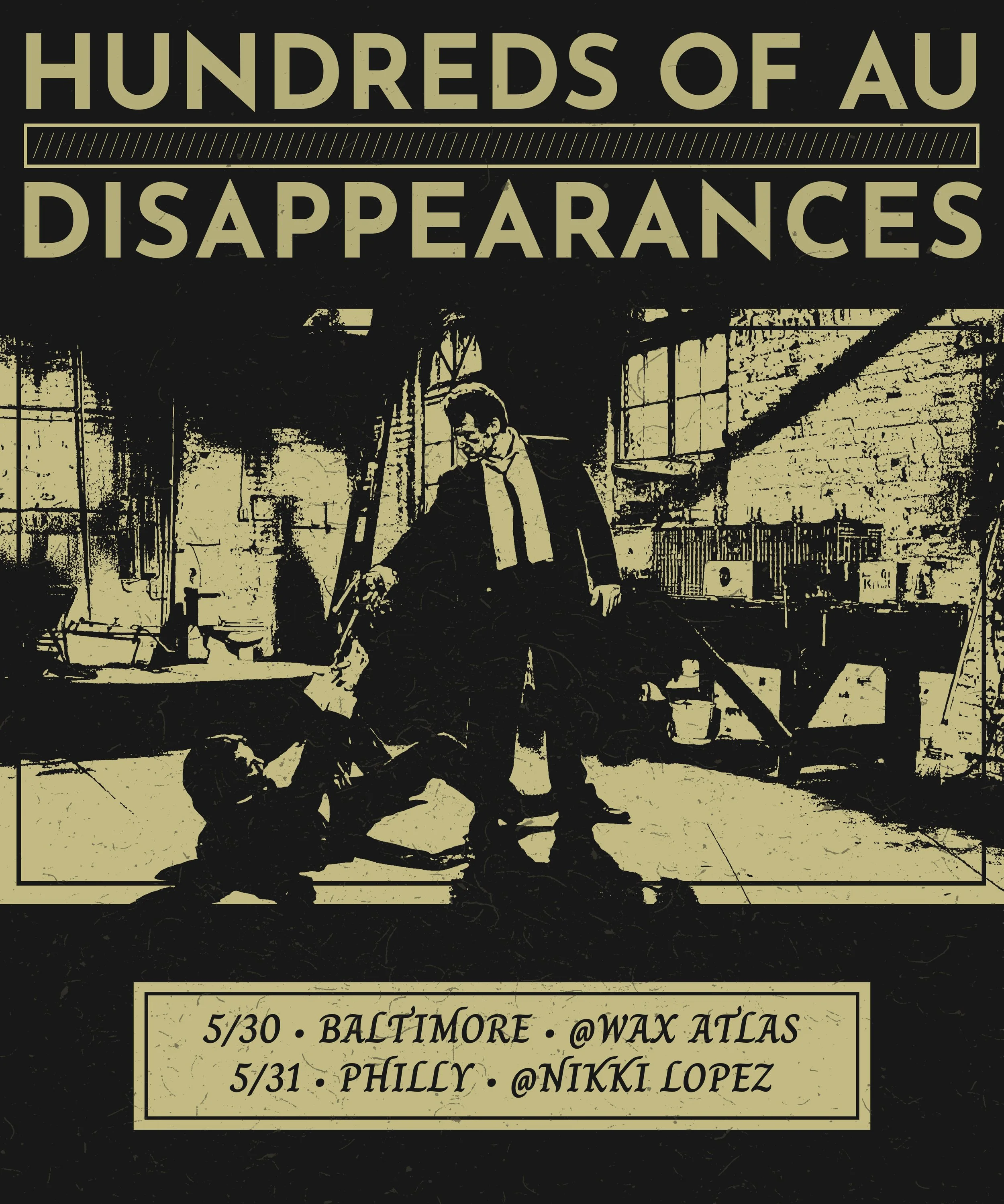
///hoau_Disappearances 5.30-31
Promotional flyer created for a short run of live performances, combining rigid typographic hierarchy with heavily degraded cinematic imagery to create a bleak and confrontational visual atmosphere. The composition uses strong containment systems, repeated framing devices, and limited color to establish immediate readability while preserving a raw physical quality inspired by damaged print material and photocopied ephemera.
The project contrasts highly controlled geometric typography against distressed photographic treatment and deteriorated texture work, creating tension between precision and decay. Designed for both physical promotion and digital circulation, the flyer focuses on hierarchy, atmosphere, and repeatable structural systems rather than decorative complexity, allowing the imagery and typography to function as a single unified composition.